Think Local Act Global
WOW some great global players above.
Brands we all recognise
But does your customer recognise your brand when faced with it in store
Thats where we can help.
Its important to match the tonality of your local audience – in one case we worked on it was for the UK and Irish Markets – taking an iconic Global brand and making those all important “tweaks”
Don’t touch our brand they said….
So we did as we were told! ….
But we did change the wording and positioning to mean something to the UK consumer,
for example
- changing size of logos on pack
- Slightly changing the pack colour – for a more modern feel
- softened on pack language
- highlight the most important features and benefits
We would LOVE to show you some old and new pack designs to see what we mean – but some brands are so “SHY” – surprising I know – you would think they would love to show you how they have progressed…..
But face to face we could show you lots of examples of
OLD VS NEW
So many things we could do to help advise and give your brand that all important lift
We could bring your brand more to the to the forefront – increase how it “shouts” out
We could alter colours, maybe a richer colour, that said quality – there are so many iconic brands out there to inspire, for example one of our favourites the “After Eight” box – has given us impetus when branding. After Eight uses embossing on pack too.
Some brands make their packaging sparkle – by putting their product on a foil label – adds quality for very little cost,
So you see inspiration can come from anywhere
We might suggest updating the fonts
We can talk about real consumer benefits eg “ideal for use with….”
Ask us to show more examples of other pack designs successfully changed that we influenced.
“Did you know” – its widely accepted that successful brands update their packaging every 5 years – don’t be that “dinosaur” that fails to keep up.
We love how over the years and through time BP has slowly evolved –
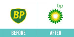
On the left the 1979 variant was the “classic” shield, progressing in 2000 to the variant as BP moved to “beyond petroleum” as their message. The logo consisted of a “Helios” symbol which featured a green and yellow sunflower epitomizing energy in its many forms – quite brave at the time – but widely accepted and memorable through time.
For more examples see
https://www.famouslogos.net/bp-logo/
So don’t delay – consider updating your logo and what it says to your customer today!